UI/UX Design
The project is to redesign a mobile application of Udemy, an online learning platform. The goal is to create a user-friendly and intuitive app that allows users to easily access and navigate through the wide range of courses available on Udemy. The app should provide a seamless learning experience and encourage users to engage with the course content.
4 days
“The system should always keep users informed about what is going on, through appropriate feedback within reasonable time.”
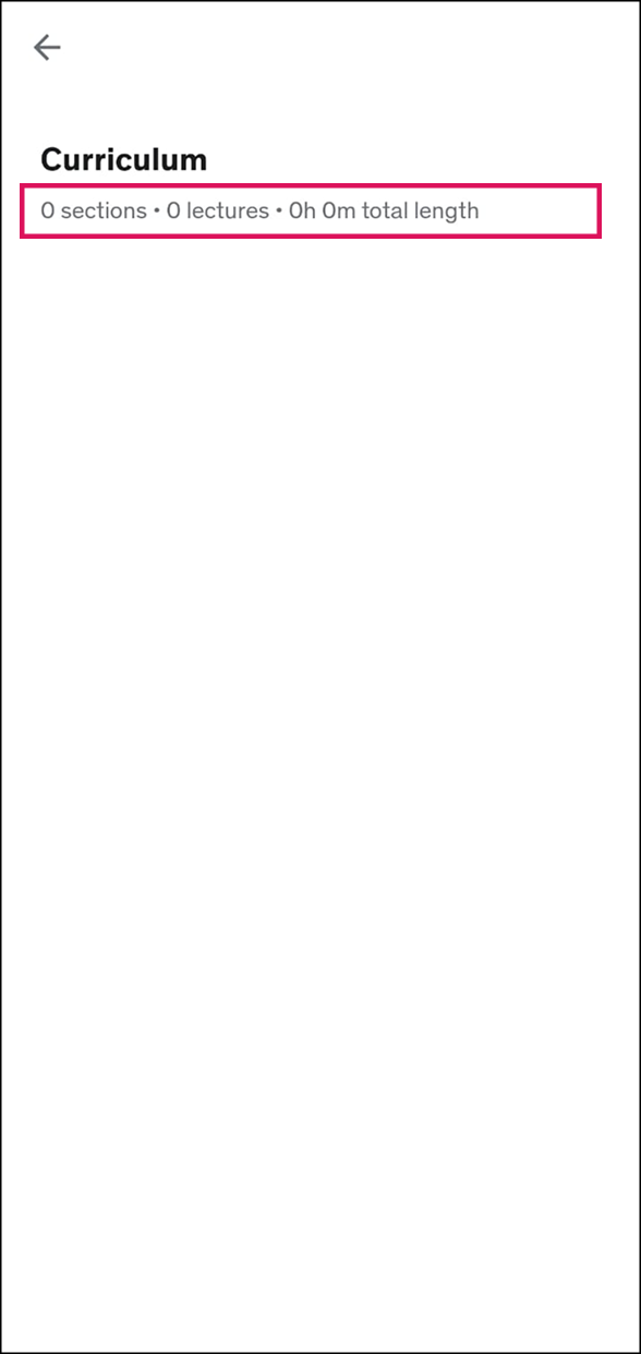
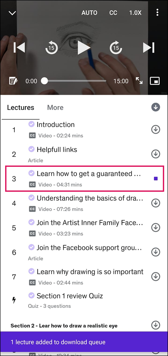
The app fails to provide Curriculum information when clicked on the button during given time.
Solution: Avoiding many redirections or optimizing unoptimized JS file may help to solve this issue.
“The system should speak the users' language, with words, phrases and concepts familiar to the user, rather than system-oriented terms. Follow real-world conventions, making information appear in a natural and logical order.”
This application follows all parameters and has a sense of matching its environment with the real world.
“Users often choose system functions by mistake and will need a clearly marked "emergency exit" to leave the unwanted state without having to go through an extended dialogue. Support undo and redo.”
After accidently clicking on on download icon, cancel download button was not clearly mentioned
Solution: Add a CTA at the bottom sheet incase user wants to cancel downloading.
“Users should not have to wonder whether different words, situations, or actions mean the same thing. Follow platform conventions.”
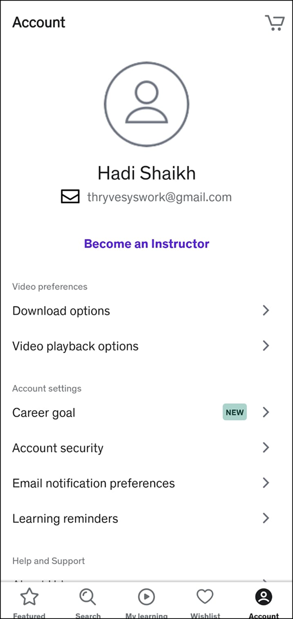
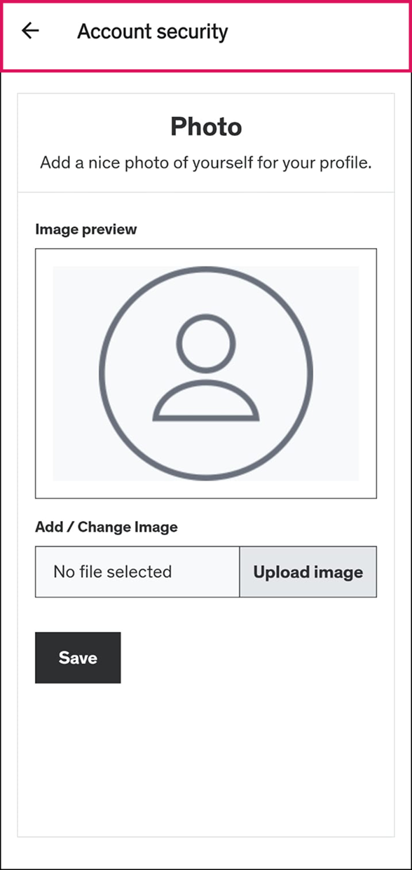
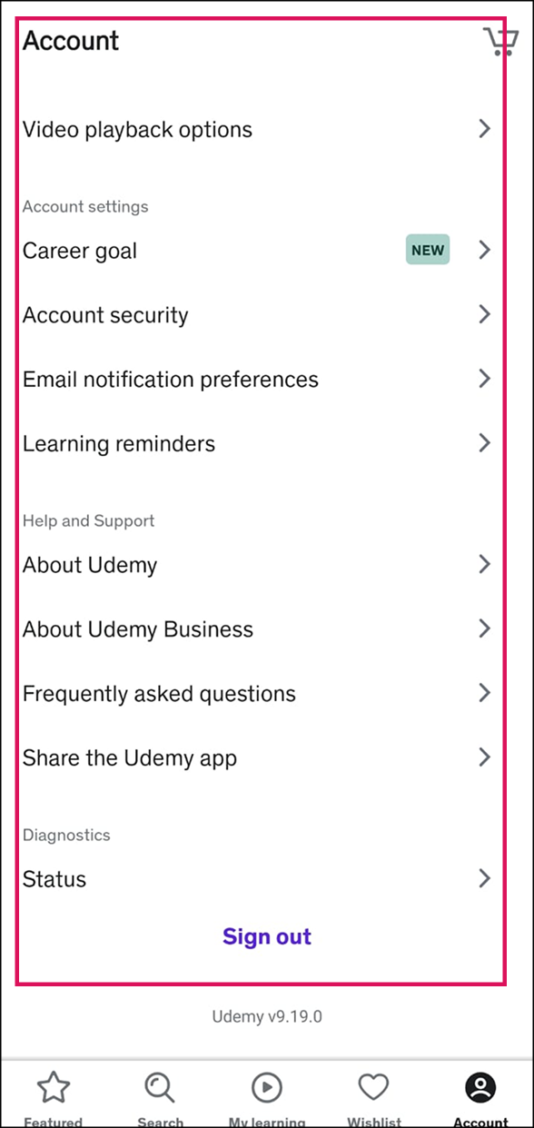
Udemy has done a neat job to keep flows, but I noticed that changing DP has been pushed into Account Security.
Solution: Give basic options upfront rather than pushing them into complex options.
“Even better than good error messages is a careful design which prevents a problem from occurring in the first place. Either eliminate error-prone conditions or check for them and present users with a confirmation option before they commit to the action.”
Udemy has kept from clear and neat error messages to keep user inform before committing it throughout the app.
“Minimize the user's memory load by making objects, actions, and options visible. The user should not have to remember information from one part of the dialogue to another. Instructions for use of the system should be visible or easily retrievable whenever appropriate.”
User is well directed with clear information and infographics. Also rest user flows are well connected and easy to understand.

“Accelerators — unseen by the novice user — may often speed up the interaction for the expert user such that the system can cater to both inexperienced and experienced users. Allow users to tailor frequent actions.”
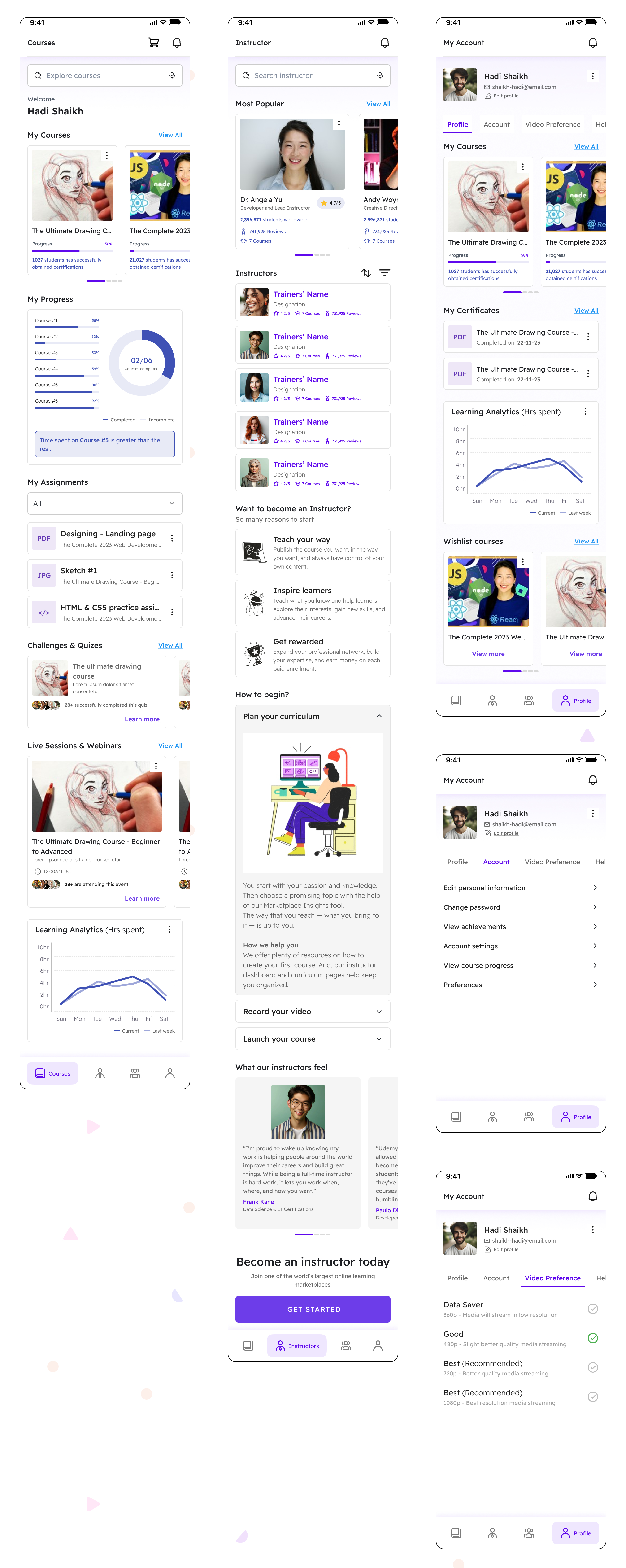
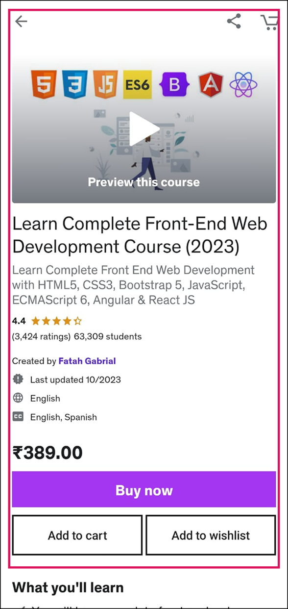
After dividing two user flows, primary and less prominent, I analyzed that the first page on which user lands on is feature page which look very similar to a webpage. If a user wants to purchase or enroll into any course, the user has either scroll down a lot or search for it which is really diverting the users’ cognitive focus.
Solution: Udemy should give priority to enrollment/purchase and push rest marketing data in less prominent options or can be given a separate option as well.
“Dialogues should not contain information which is irrelevant or rarely needed. Every extra unit of information in a dialogue competes with the relevant units of information and diminishes their relative visibility.”
Although Error messages are clear and well structured, Udemy has paid less attention on maintaining design standards. Also on mobile view subtitles blocks the video viewport making it uneasy to get along for students unfamiliar with the default language. From giving too much information upfront to inconsistency in heading, sub-heading and paragraph.
Solution: Lessen the extra information in course details which, maintaining consistency of the design system would help.
“Error messages should be expressed in plain language (no codes), precisely indicate the problem, and constructively suggest a solution.”
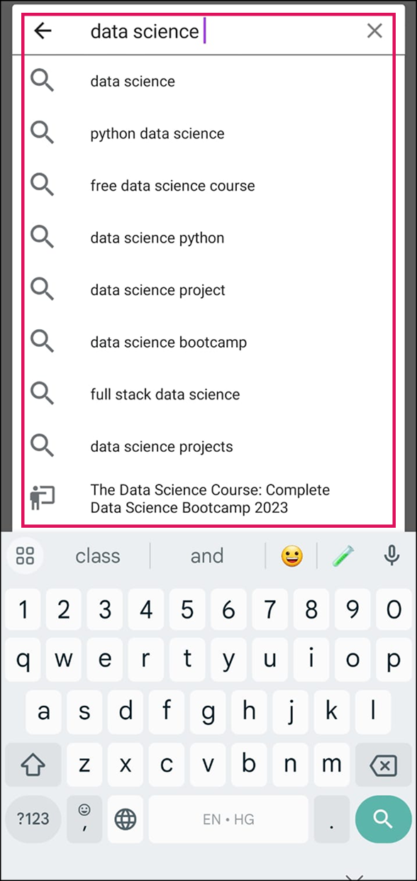
Search result sometimes do not match the search keywords and user is not instructed about the next step which should be taken..
Solution: If the search result is not found, Udemy should provide the user with relevant or similar matching search results or inform the user with clear error message about the mistake.
“Even though it is better if the system can be used without documentation, it may be necessary to provide help and documentation. Any such information should be easy to search, focused on the user's task, list concrete steps to be carried out, and not be too large.”
Udemy has provide all necessary documentations and help to direct users throughout this application.
After evaluating Udemy application, following are the key insights that I could conclude:
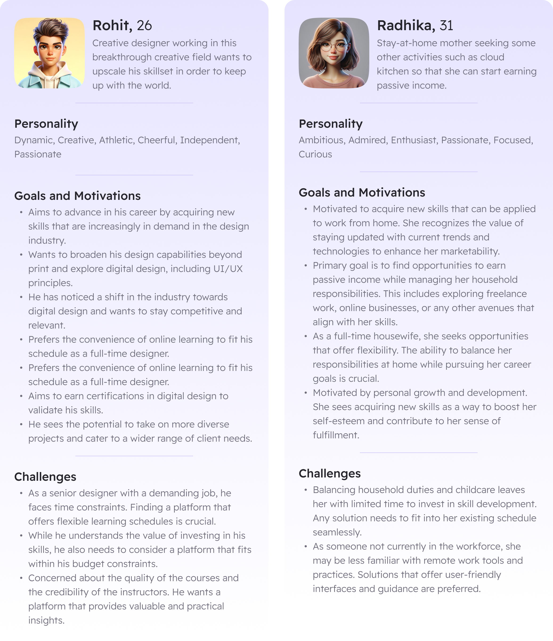
Going through both of the persona’s, following is the insight which could be gathered: